Content
- UX Design Principles – What You Need To Know
- It’s All About The Context
- Oh, The Humanity
- Be Available To Do Business
- Keep It Simple
- Embrace These Concepts
- So, What About The Process?
- Why Is It Such A Pain?
- Talk To The People
- The Who's Who Of Your Customers
- X Marks The Spot
- The Art of Wireframes
- Building The Prototype
- Understanding User Interface Elements
- Adaptify Can Help You Apply This UI/UX Wisdom To Your Website Today
By learning a little about key design principles and the toolkit that digital marketing players have at their disposal, we may just begin to demystify the secrets behind what makes for a positive user experience.
Firstly, take a moment to brainstorm some of your favourite online stores. Settle on one. What makes it stand out? The easy-to-follow navigation? How simple is it to go from the product page to checkout? Gathering helpful information via searches quickly?
Alright, put that aside for a moment and let us turn our attention to the web developers of your favourite website. What was their intention?
To be blunt, they were most likely creating a digital platform with you in mind – a website that is easy to use, designed to deliver informative details and enables visitors to act with purpose.
The user experience, or UX, is concerned with the end user’s overall experience – their perceptions, emotions and responses to a company’s products, systems or services. To be more specific, UX is defined by ease of use, accessibility and convenience.
While UX is frequently discussed in tech-related conversations, such as smartphones and websites, it is not necessarily a new concept but rather one that is constantly shifting and changing in line with advances in technology and how businesses and consumers interact with devices spec’d for eCommerce transactions.
Attention spans are waning and customers are looking for the quickest and simplest methods to do business online. Unsurprisingly, UX plays a major role in leaving an impression on a customer’s overall experience with a brand.
If you are reading this there is a high probability that you manage a business of your own or assist with the day-to-day rigmarole of a firm in Australia or abroad. For the digital marketing savants among us, they realise that customers can slip away from your sales funnel in just seconds if they determine that your website or app is not useful, easy to use or even helpful. Based on our research, the team at Adaptify can confirm that most website visitors will choose to either stay or bounce within a minute of opening a website page.
So, how do you attract website visitors and convince them to linger – in the hopes that they find your products and services appealing? If you haven’t guessed yet, a thoughtful and thorough exploration of how to apply UX design is a great start.
Before we dive right in it is worth covering off some of the most common UX variants you may encounter in your travels.
Interaction Design Foundation breaks it down into four distinct categories including interaction design, i.e. the interaction between a user and a product (with the aim of this interaction to be pleasant for the end user); visual design which encompasses illustrations, photography, colour and other elements to enhance a user experience; user research which deals with how a business works out what their customers and website visitors want and need (for example, does your online presence address or solve a known issue?); and information architecture which is just a fancy term for a structure and labelling content for a user’s point of reference.

This TravelSmart map of the city of Melbourne, for example, demonstrates information architecture in action as it is designed to assist tourists and public transport users. The attention to detail with the roads, landmarks and public transport routes are all documented with easy-to-read visual references and a legend to tie all of those elements together.
UX Design Principles – What You Need To Know
The digital landscape is constantly changing. Emerging technologies on both software and hardware fronts makes for a frenetic marketplace where nothing stays the same for too long. But when you look at UX, though, there is some stability in the form of visual balance or tried and true design principles. Some aspects of business will remain consistent and that is where presenting clear, to-the-point and critical information is quite often the preferred way to go. Great website design allows users to navigate landing pages with ease and essentially allows for a smooth buying journey.
Great UX empowers website visitors and keeps them trawling rather than bouncing – which is what every eCommerce business owner wants. Driving high quality traffic to the right places organically is an achievable goal so long as the UX is in order.

Earlier we hinted at how new tech and brand new devices have a tendency to transform and change how companies do business online. Again, the essential components of what makes for a solid user experience do not necessarily change so much as how they are implemented and executed.
UX designers generally adhere to a series of common methods that ensure consistency and focus.
It’s All About The Context
Firstly, what is the context? What is the purpose of the landing page? Your website visitors need to know where they are on both a macro and a micro level. Think about the sitemap, is the journey from home to products to the online store clearly labelled and easy to understand? Website design that works will always signpost to the user where they are so that they are in control and can move from page to page without getting lost. Effective user interfaces guide rather than hinder end users.
Oh, The Humanity
When checkout machines were installed in supermarkets around Australia there was an uproar about job cuts and the elimination of human-to-human interaction when purchasing groceries. Automation in this instance, for many, heralded the dawn of a new era, one that replaces people with drones. And then there are those who take this thinking even further and relate the beeps and repetitive automatic speech messages to something as terrifying as Skynet – you know, the Artificial Intelligence (AI) created by Cyberdyne Systems that gave rise to a relentless army of machines that wiped humanity from the face of the Earth in those Terminator movies. We may laugh at how absurd that science fiction is but remember that its origins are founded in our own fears and anxieties about machines becoming a threat to our existence.
To cut a long story short, people prefer to shop with other people and conduct business with fellow human beings. So, where does UX fit in here? Well, trust is an important part of facilitating online transactions. You need to ensure that your brand is approachable and run by regular folks rather than monotone, boring cyborgs. Just be yourself.
Be Available To Do Business
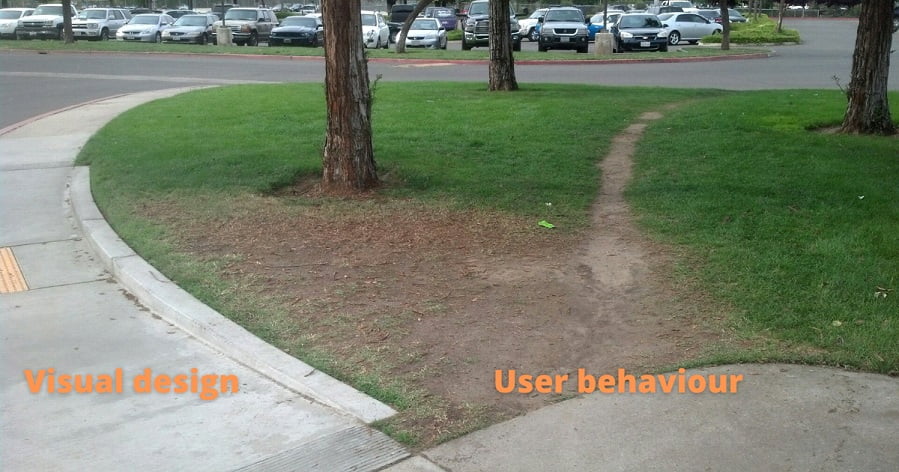
At the beginning of this guide we talked a little about user behaviour. Time is precious. If the average website visitor has under a minute to work out whether they want to stick around or leave, you need to make sure that your business and digital presence is easy enough to locate. Cruisy navigation is also essential. If users have to work too hard to find what they need from you, they will split. So, be findable. Sometimes this is easier said than done though. Feedback from the online community, your colleagues and the experts at Adaptify can help solve any issue with your preferred clients reaching you on a regular basis.
Keep It Simple
A general rule that never goes astray, keeping it simple. That’s right, be consistent and straightforward in your digital marketing strategies. Trying too hard can often have you confusing the market with convoluted messages. Your customers will thank you for laying out a fun and easy user interface that cuts the noise. You may even notice your competitors doing all sorts of crazy gimmicks to grab attention but if they are getting too sophisticated with their visual aesthetic and communications, it will be all for nought. Just keep it simple, ok.
Take the image below as an example. When there’s too much clutter on the front-end you lose focus. The moment you lose focus, your core messaging loses its potency and will not be as strong as it should be. On a side note, social media campaigns that tackle multiple channels tend to fail spectacularly without the right guidance and consistency in content output and user engagement. This is a great example of taking something, in this instance social media, and focusing on your most important platform instead. UX is relevant here because you’ll most likely have social buttons on your website and in some instances the social media channels can mirror the UX of the parent website. This is just one of many examples of how UX complements other important web design aspects.

Embrace These Concepts
UX designers, when in doubt, always fall back on these principles because they are a solid foundation to build from. If something isn’t working or needs improvement, there is a good chance that it will come down to whether the element is missing the context, fails to speak to your fellow human, is not able to be found quickly by your customers or is way too complicated to be of value.
So, What About The Process?
There’s always a process, isn’t there? From agency to agency, UX design processes can vary. At Adaptify, our UX design doubles down on the human-centric side of things and considers the needs of your target audience. What issues will they need to overcome? Here, UX designers can try new ideas in a test environment or even conduct AB split testing with a live website and measure the results. Where user interfaces are concerned, you want to implement systems that do the job well. While web devs can make some educated guesses on how to tackle it, it’s the users themselves that will often have the final meaningful say.
Why Is It Such A Pain?
The user experience is commonly hampered by challenges or obstacles that get in the way of what should be a smooth, harmonious journey. So how do you flatten these bumps on the road as it were? Well, it all comes back to the user, put yourself in their shoes. What’s their background? What experiences do they have and how will that influence their on-page decisions? The role of a proficient UX designer is to do a little investigative analysis and try to understand the behaviours of these website visitors. Why do they do what they do? Is there a way to guide them to click somewhere else or make the website more intuitive somehow? It’s not so much about altering behaviours entirely but more about how the web dev team can manipulate the digital environment to coax a more favourable outcome from the users.
So, that sounds simple enough. But how do you do that?
Talk To The People
To cut to the chase, interview the very individuals who frequent your website. Ask them about the pages they visit, the products they like to purchase and become familiar with their own journeys. Every little bit will help to unlock the secrets of how consumers navigate your online platforms.
If direct questioning seems puts you off, try setting up some of your customers with a live trial where they are left to peruse your products while your team observes. By watching their keystrokes, queries and use of navigation elements, you should be able to work out pretty quickly if people use your website as intended or if there really are important things missing that should be worked in for a more seamless user experience.
A solution here could be as simple as adjusting a call-to-action message on a landing page or updating your top nav panels with a better priority.
In the event that you’re not able to score any willing participants for testing purposes in-house, consider conducting surveys with targeted questions. To learn more about how to set up a survey or how to refine your UX process, give the digital agency Adaptify a buzz.
The Who's Who Of Your Customers
With a little user research under your belt you might find it worthwhile to generate user personas – generalised representations of your top customers based on the data you have on-hand. These profiles assist businesses with getting a better understanding of their core clients as well as potential leads. This extra step can be advantageous and extremely powerful for your marketing strategies because it means that when you look at finetuning your products, serves and overall messaging, it will be bang on target.

A typical user persona contains a customer’s primary and secondary goals, their challenges and what a business can do to address their concerns. Here is an example of what a user persona might look like in the context of an activewear apparel business. Kerry Shopper is a middle-aged part-time worker who aims to spend more time at the gym. Her challenges are her work commitment and juggling commitments at home with the family. To help Kerry achieve her goals, an apparel business could present an activewear product line that sells itself as being suitable for use at home as well as the gym. Also, if Kerry is engaged in social media fitness groups there might be an angle there for a drip-feed email marketing campaign if Kerry leaves items in her checkout basket.
These user personas are invaluable for UX designers because they will help solve problems or assist with testing out new solutions in the pursuit of increasing click-through and generating additional sales.
X Marks The Spot
While user personas are helpful with categorising your website visitors, they can only serve as a guide at best. Remember that everyone has their own way of doing things which can complicate your marketing strategies. What we mean here is that you cannot expect one method to work for everyone. For instance, if you go to read the about us page, some people might go straight for the top nav option. Others might instead take a look at the footer of the website and go from there. And then you even have people who out of habit look at the sitemap or simply Google it.
To map out the user journey you need to discern their main objectives and allow them the opportunity to complete their task. Consider a simple eCommerce storefront. Every variable that enters the mix will exponentially open up the number of options available to your users at any given time. Be prepared for a variety of behaviours across multiple platforms including desktop and mobile. Put a little thought into this part of the journey and you can help simplify the process for your customers and even streamline it so that it is as efficient as possible.
The Art of Wireframes
After much head-scratching and note taking, you should have a good idea of what the user journey entails. You can use this information to produce an illustration of sorts of what your website should look like via website wireframes.

These are helpful for determining the primary features of a page while making allowances for negative space, images, copy and the broader layout. You can learn a lot about the pros and cons of the user experience in this stage. What you will mostly realise here is how functional your website and whether there are any glaring issues that need to be resolved ahead of time.
Building The Prototype
By this stage you will have invested a lot of energy and resources into setting up your ideal user interfaces. You’re getting closer but we’re not finished yet. The prototyping phase is where you get to take your UX web design for a spin and try to break it.
Prototypes are a step up from the wireframes and include the actual look of our website i.e. typeface, images, colours, formatting – the whole shebang. They are also meant to be interactive so that you can test it out like users would treat it in a live environment.
Don’t be disheartened if you find yourself overwhelmed by a wave of pressing issues and a mountain of changes to be actioned. After all, doing this heavy lifting now will pay dividends later. To learn more about prototyping and troubleshooting your user interfaces, check in with the experts at Adaptify.
Understanding User Interface Elements
Let’s take a moment to break down user interfaces which focuses on the look and the front-end of your website.

Similar to UX designers, the UI folk have a couple of tools under their belt as well.
UI designers can use informational components to enhance the reading experience or provide additional information. These include message boxes, notification and even progress bars and charts.
Another neat tool is breadcrumb navigation which can boost the usability of a website simply by allowing the user to see their location on the site in a logical, hierarchical view. This can be achieved with a minimalist approach and can do a lot to improve the user’s journey.
And then there are input controls that provide individuals with a couple of options to respond to such as drop-down lists or checkboxes. The key here is to keep the information simple and to the point.
Adaptify Can Help You Apply This UI/UX Wisdom To Your Website Today
So what have learnt today? In summary, seamless navigation is indeed the ideal path towards the best possible conversion rate.
The Adaptify team consult with a specialised division of UI/UX web devs to ensure you benefit from responsive, mobile-friendly websites and complementary digital strategies.
A streamlined website enhanced with a user interface that is a breeze to navigate and enables a logical flow between pages will most certainly stand out among the competition.
In terms of UI/UX you should consider keeping it simple on the front-end of the website and ensure sufficient visual design flow that caters to the needs of your users.
When in doubt, fall back on those design principles we discussed earlier and check in with the professionals at Adaptify – they’ll get you on the right track.


