Content
- What is a landing page?
- Where do you start when you’re creating one?
- In terms of design style? Is the content first? Or the Layout?
- What’s an easy mistake to make with Landing Pages?
- What surprised you the most with landing pages?
- Is colour important?
- Describe social proof?
- What is a Lead Magnet?
- How busy should the navigation be?
- Are there ways to save time in creating landing pages.
- Are there ways to save time in creating landing pages.
- Any last words
- Looking at Landing page Campaigns
In this article, landing page and CRO Marketing specialist Saku Koskinen discusses in a candid Q & A, the strategy behind landing page design.
5 minutes required reading time.
With Saku Koskinen / Digital Marketing Strategist
The first question to ask. What is a landing page?
Where do you start when you’re creating one?
Before starting, I find out what are the goals of the company or business. Then the ultimate objective of the landing page.
Do I want the visitor to make a purchase? An enquiry? To pick up the phone and call?
A rule of thumb for a landing page is that it shouldn’t have more than one conversion goal per page. That means your landing page, has one goal.
For example, e-commerce websites try and sell multiple wares. Whereas a landing page only tries to sell one. Why?
Well, perhaps it is to obtain an email (for future marketing), to promote a niche item or to sell to a new demographic (without overwhelming them with products).
In terms of design style? Is the content first? Or the Layout?
Content and visual style go hand-in-hand, but the content does come first. Some people work the other way around but that doesn’t work for me.
Great content provides information but doesn’t overwhelm.
And it’s obvious from content size whether the landing page will be successful or not. The right amount of content makes the visitor feel that he is making an informed decision and is curious enough to take action.
The design and layout are made to look beautiful and appealing. But it is also leading the eye, towards that which is trustworthy.
People do not realise how web literate they have become, even in the last decade. And, and design is a sign of trust these days.

Tell us a little about Conversion Rate Optimisation…
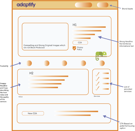
Conversion Rate – the percentage of visitors who took action- can be optimised in different ways. By having a strong hero section with three essential elements; the headline, visuals and CTA [Call-To-Action], you can increase your conversion rate a lot.
To increase your conversion rate, focus on using colours that stand out, having appealing visuals, and implementing strong call to actions. Avoid generic ones like “Learn More” or “Submit” and rather go with more action-oriented ones such as Start a Trial, Claim my Free Consultation etcetera.
To find out what converts we at Adaptify, a SEO expert company use heat maps to find out what our visitors click, which sections they are more likely to scan through, and which CTA buttons perform the best.
What’s an easy mistake to make with Landing Pages?
What surprised you the most with landing pages?
Is colour important?
Yes, very important. However, there is not a universal winning colour for conversions.
It is a known fact that black, for example, isn’t very high-converting colour whereas orange and light blue are, but still it doesn’t mean that always going with orange or blue will be a winner.
Colours should be consistent with the branding but also make the content stand out.
Generally, you should choose a colour that highlights the element you want to take the visitors’ attention to, be it a sign-up form or a CTA button that has to stand out from its surroundings.
With A/B testing you are able to find out which colours work for each landing page.
Describe social proof?
If you were to tell someone with no experience how to make a landing page, what would you say? Supplementary question, what skills would you get them to develop?
From my experience, the best way how to learn how to make a landing page is to create one. Then test it, redo it, test it and do it again.
Essential skills you need to develop in order to build a high converting landing page is to be able to write good copy, have an eye for visuals and skills to build websites.
What is a Lead Magnet?
How busy should the navigation be?
Are there ways to save time in creating landing pages.
…Any last words
Looking at Landing page Campaigns
Book a FREE consultation with Adaptify. We can discuss your objectives and help you with higher conversions. Call 1300 423 566 today.


